Hot Home Trend: Color Block Your Kitchen Cabinets
- At September 24, 2018
- By
- In Real Estate News
By Melissa Dittmann Tracey, REALTOR® Magazine
Getting a little mismatchy in kitchen cabinet color designs is no longer being viewed as an unfinished reno job, but instead perfectly stylish in fitting with today’s trends. These “tuxedo kitchens,” as they’re nicknamed, are where the upper cabinets may be in one color—like in all white—and then the lower cabinets are in a contrasting shade, like a gray or dark walnut. It’s essentially a way to color block your cabinets.
The idea of going with two different shades on your kitchen cabinets may make some homeowners’ a little uneasy, but it’s nothing to fear nowadays and can actually make your kitchen look more open.
Typically, with tuxedo cabinets, the lighter color is on top and a darker color is on the bottom. It can help make a kitchen seem taller when the lighter color is above. It can also create a focal point, when a contrasting color is used on a kitchen island. And the differing shades can also break up the monotony of all one color cabinets, particularly in all-white kitchens.
Some real estate studies are suggesting that white cabinets contrasted by a dark navy blue or black kitchen island is among the most common tuxedo kitchen pairings in some real estate listings too.
Jonathan Olivares Tells the Story of the Shop Tool Behind Some of His Most Recognizable Designs
- At September 22, 2018
- By
- In Home and Design
Industrial designer Jonathan Olivares’ red vise has journeyed with him from his childhood basement to the world stage.

Of all my possessions, this 65-pound vise is the one I’ve had the longest. My mother gave it to me for my 10th birthday. I’ve always thought there was something comical about giving a small boy such a big vise, but she insists it was purely practical and that she thought I would need something sturdy for the woodworking I was doing.

Boston-born, Los Angeles–based designer Jonathan Olivares’s red vise has been by his side for almost 30 years. He’s used it to create everything from childhood toys to an instant-classic chair for Knoll.
Photo by Michael Friberg
As a boy I used the vise in my basement workshop for making toys. As a teenager I used it to put together skateboards. When I started my design practice in 2006, the vise was there to help me make models of my first furniture pieces, including‚ later, the Olivares Aluminum chair for Knoll.
I admire the vise’s red paint and the patina it has gained over time‚ and the hard and soft geometries of the forged steel. Many of my furniture designs have been done in painted metals‚ including the Aluminum bench for Zahner and the Smith steel cart for Danese. Today the vise sits in my study and reminds me of the trust that my mother placed in me—take risks‚ work with good tools‚ don’t get hurt‚ have fun—and of the longevity and myriad functions of truly useful objects.
PURO Kraków Kazimierz
- At September 22, 2018
- By
- In Home and Design
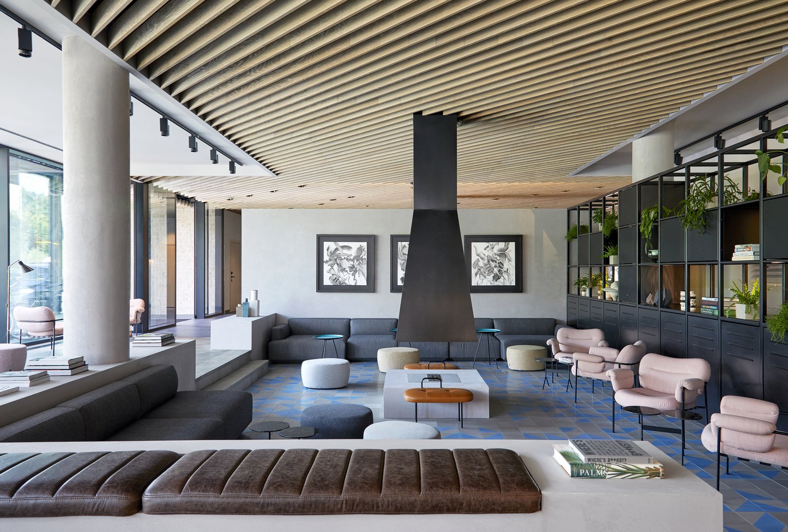
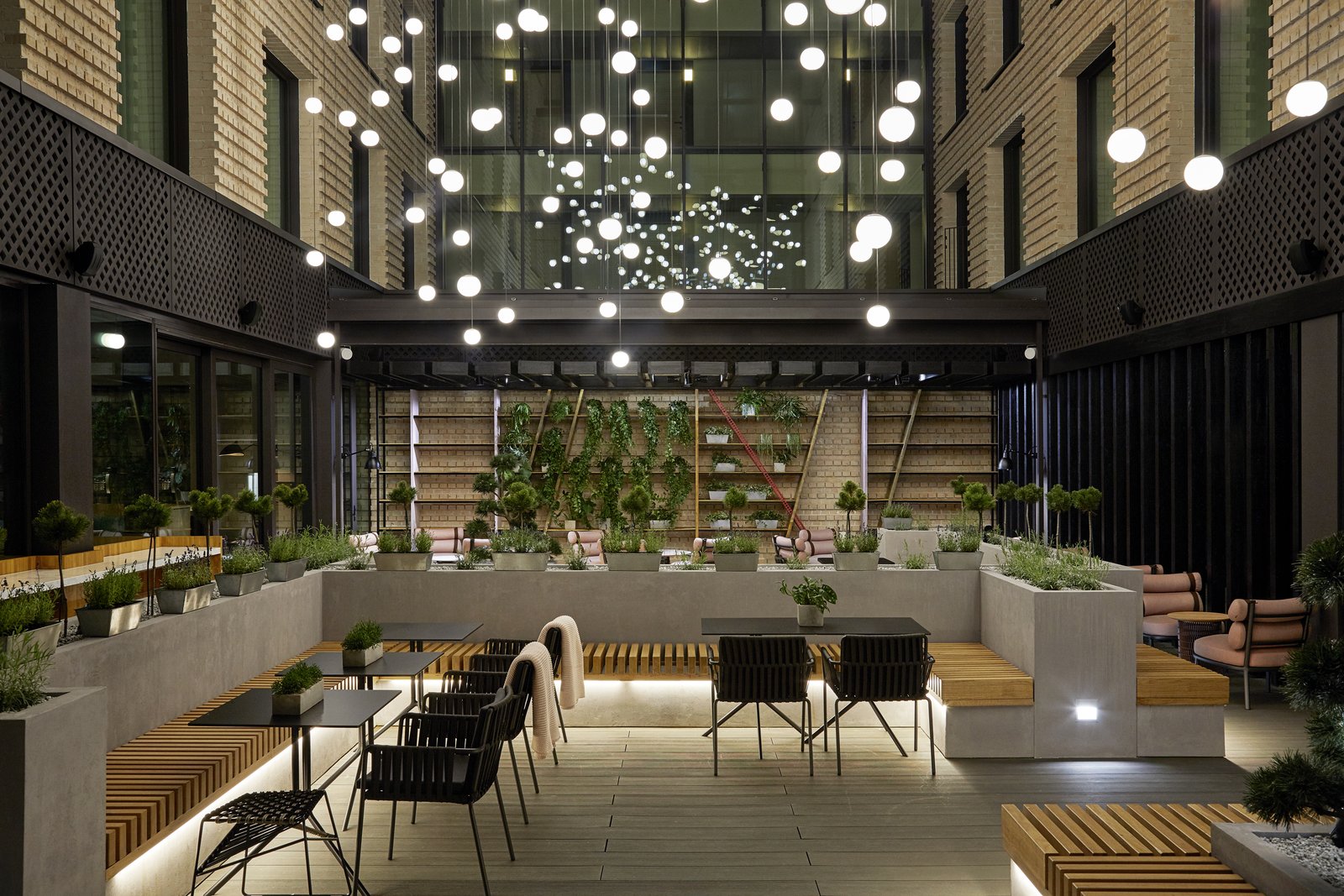
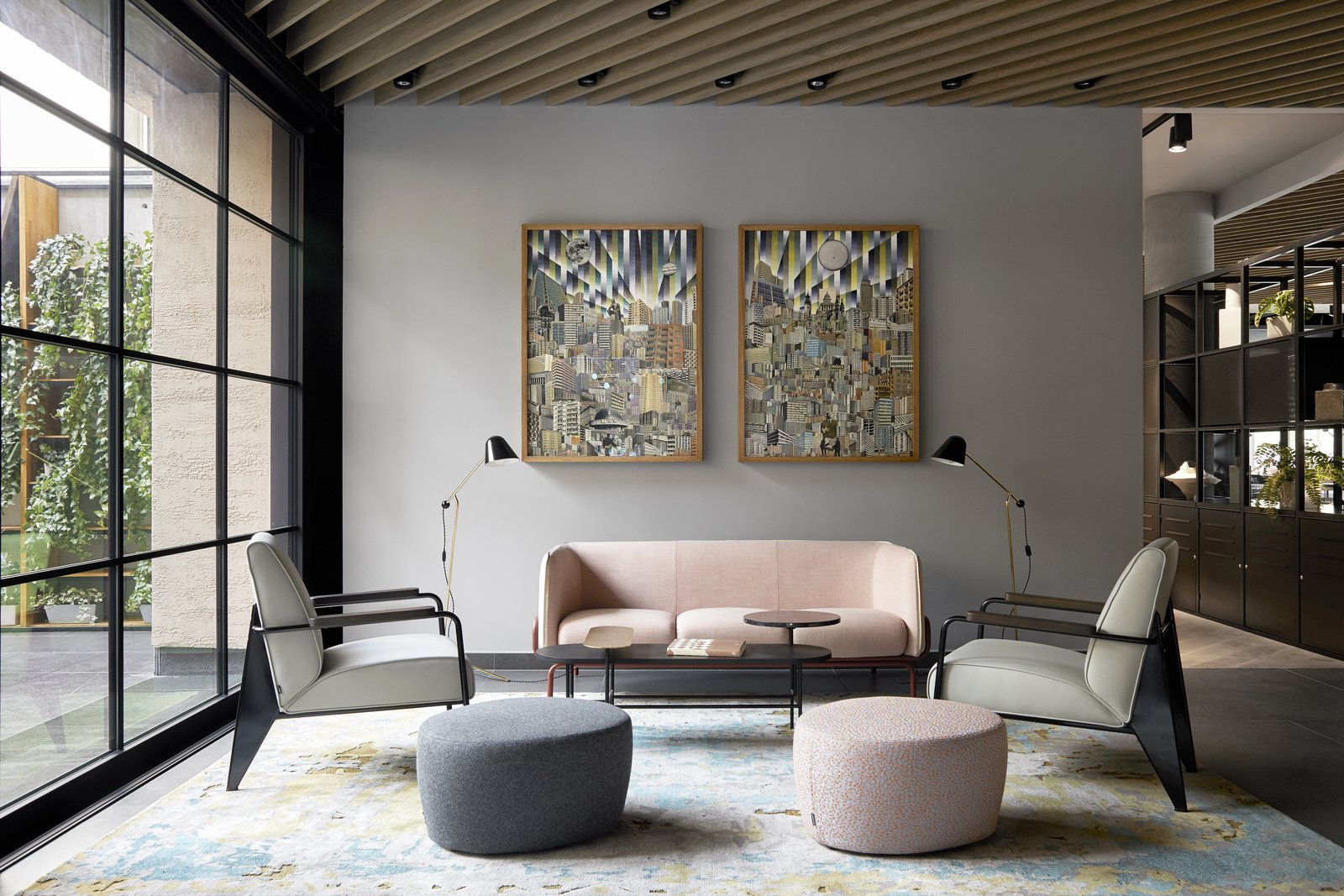
PURO Kraków Kazimierz by ASW Architects and Conran + Partners is a refreshing hotel experience that allows guests to absorb local culture.
In the heart of Kraków, Poland, is where you’ll find PURO Kraków Kazimierz, a beautiful new 228-key hotel nestled within a bustling creative community. Designed in collaboration with ASW Architects and Conran + Partners, each room features an individual curation of visual modern art that was sourced from artists both locally and throughout Europe.
See more on Dwell.com: PURO Kraków Kazimierz - Kraków, Lesser Poland Voivodeship, Poland
Homes near Kraków, Lesser Poland Voivodeship, Poland
Apartment in Ahuehuetes Norte
- At September 22, 2018
- By
- In Home and Design
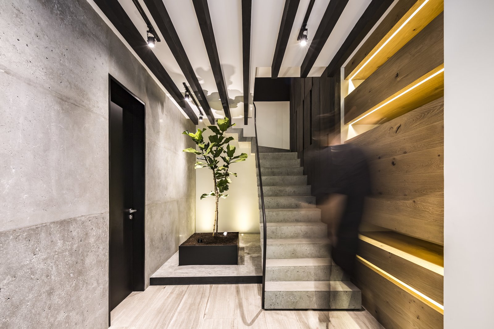
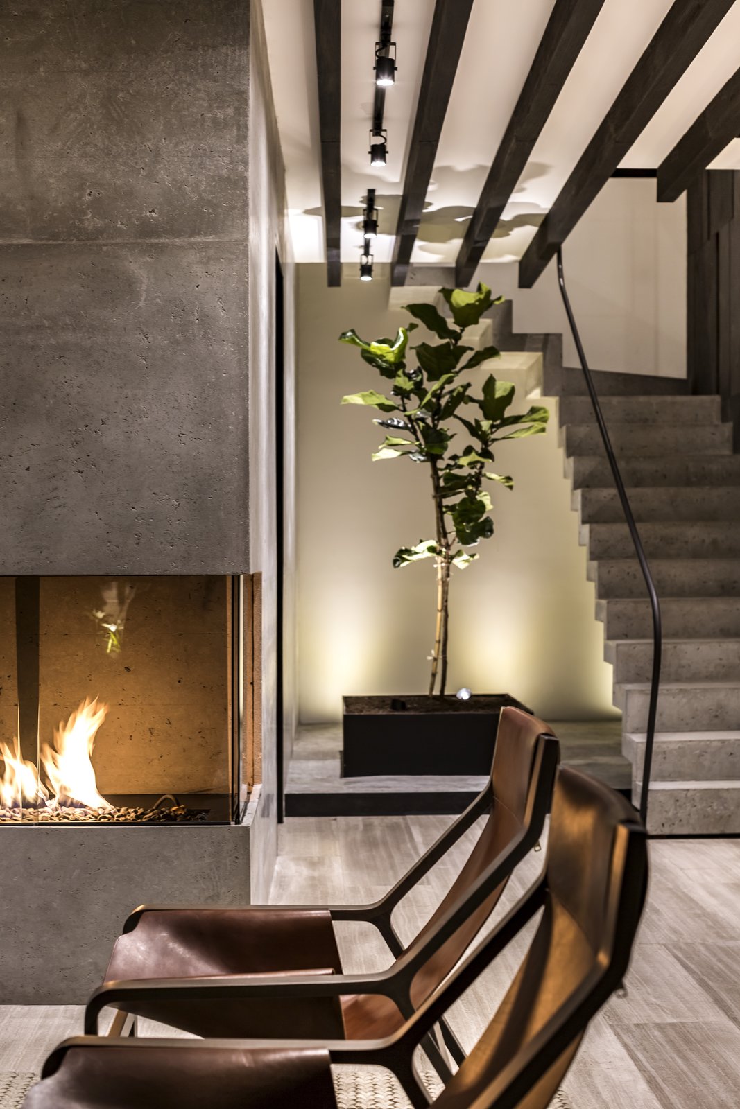
Located in a residential building in Bosques de las Lomas, the design process for this apartment was approached from a sober perspective in architecture, a monochrome scale interrupted by color accents provided by vegetation and subtle details in the furniture. The composition aspires to reflect a timeless space capable of providing comfort and sense for those who inhabit it.
One of the compositional axes of the project was the consideration of the panoramic views to the exterior that are framed by the abundant vegetation, a main characteristic of the area, a factor that influenced the configuration of the two levels of the apartment, having as a main objective the creation of an inner atmosphere, comfortable and in harmony with the elements that surround it.
Accessing the ground floor you are welcomed by a bold and striking marble element. Taking advantage of the length of the main space, the living room and dining room visually communicate and complement each other by their relationship with the terrace and the views to the outside, generated by large windows. The relationship of the kitchen with the dining room is achieved through a set of fine glass doors, which generates a convergence between the two spaces, and at the same time, a set of views becomes present thanks to the reflections created by the vertical garden that decorates the far end of the dining room .
The configuration established on the upper floor integrates private spaces, in which the finishing palette reflects a sober and comfortable atmosphere. Within this level, the family room becomes a meeting point for complementary spaces, which can function as a common or private space. The exhibition of contrasts in the space are noted by materials such as marble and wood, concrete and steel, these materials come together to create a dynamic set that preserves a coherent color range and some details that contribute to a sensitive and balanced image.
The main bedroom stands out for its composition of materials and warm tones, having communication to the outside through the terrace and granting an interesting visual of the surrounding vegetation. On the other side of the space is the main bathroom, which acts as a link between the bedroom and a large walk in closet, however at the same time delimits the space through an inked glass and a series of blinds.
See more on Dwell.com: Apartment in Ahuehuetes Norte by Taller David Dana - Naucalpan de Juárez, Estado de México, México
Homes near Naucalpan de Juárez, Estado de México, México
Better Than Instafamous: Q&A With Instagrammer Sarah Johnston
- At September 20, 2018
- By
- In Real Estate News
By Lee Davenport
Sarah Johnston (aka @AdventuresInRealEstateYYC) has what many might call “Instagram magic.” Beyond being an Instagram influencer, Sarah Johnston is an agent with MaxWell Capital Realty—Bridgeland, in Calgary, Alberta, Canada, and is also the president-elect to the Calgary Real Estate Board. She has even brought her talents to the University of Calgary as a guest instructor on the use …
The post Better Than Instafamous: Q&A With Instagrammer Sarah Johnston appeared first on YPN - Young Professionals Network.
Metamorphosis House
- At September 20, 2018
- By
- In Home and Design
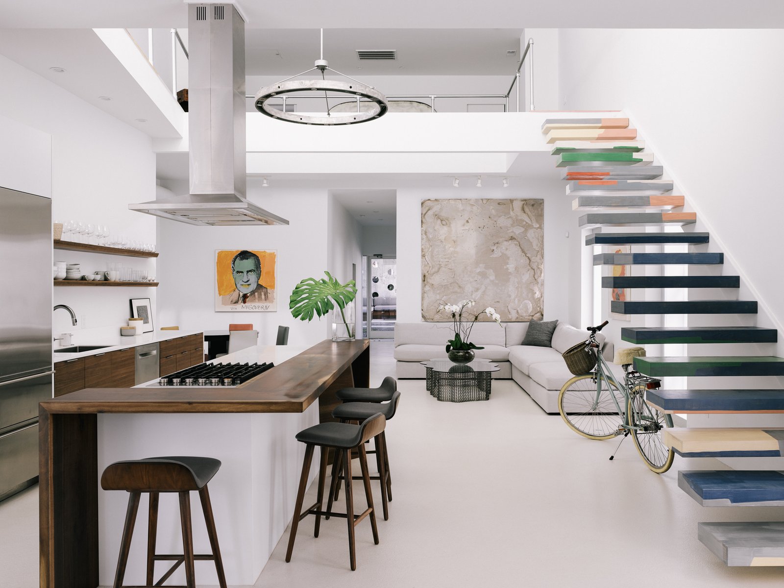
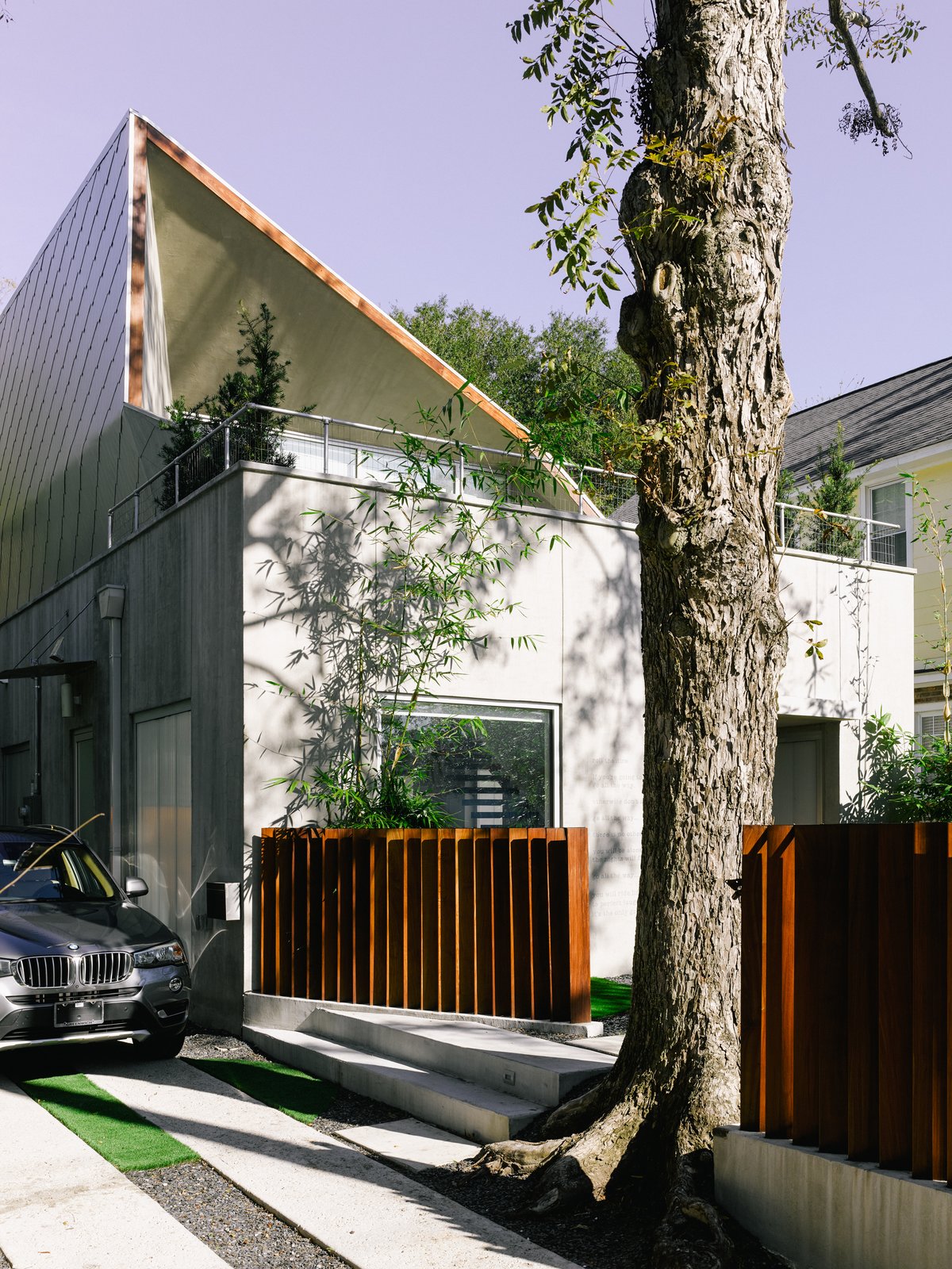
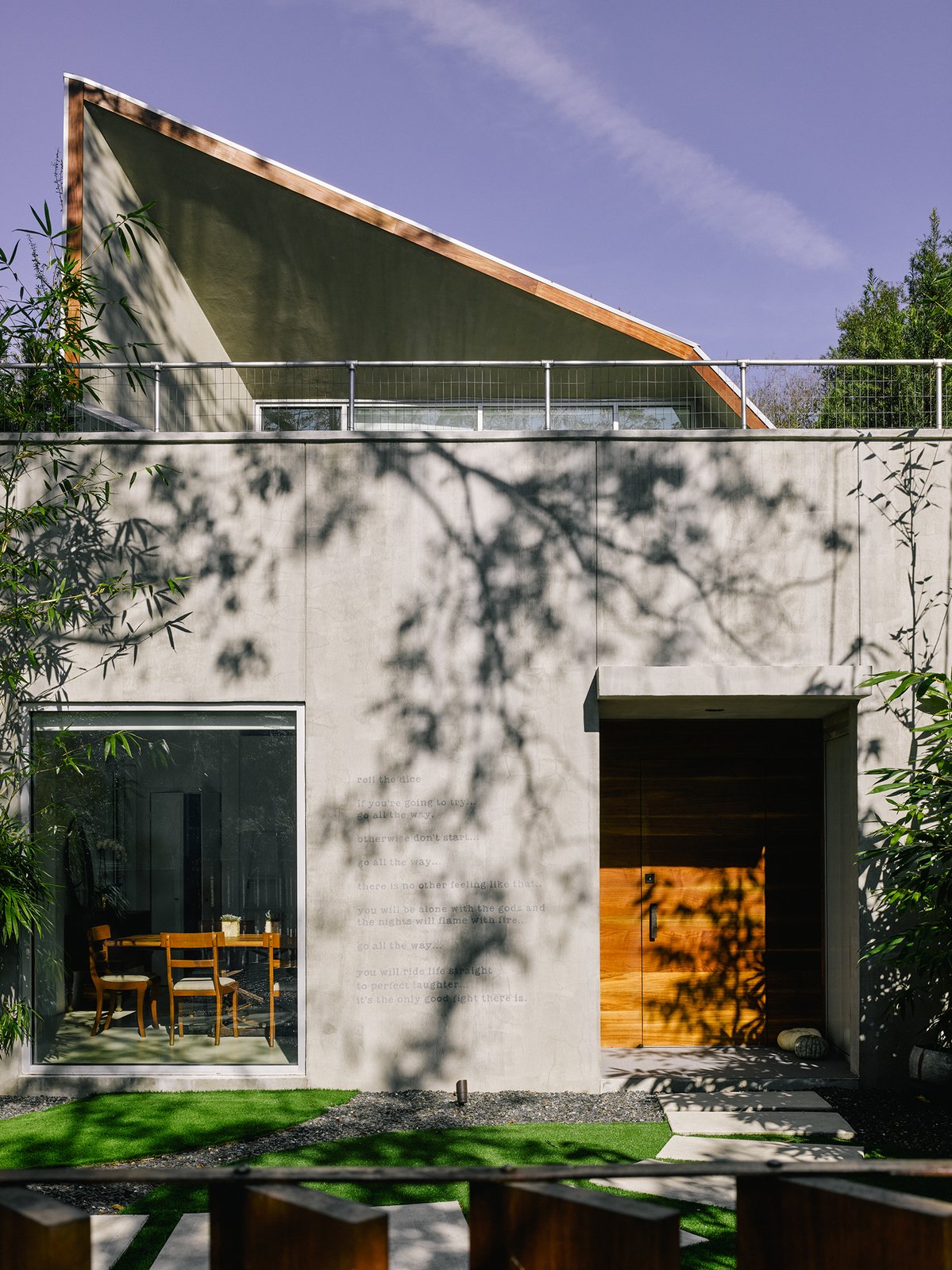
The single family residence built in Wagener Terrace close to Hampton Park in Charleston, South Carolina was originally a squat exposed cinder block duplex from the 1950’s that saw little modification over the years. The transformation that ensued saw the full spectrum of responses about the design and construction, from excitement and wonder to shock and disdain. Now complete, the single family residence has found it’s place and added to the context of the neighborhood.
The broad brush design of the house was to generate a light filled, airy volume for an owner with contemporary taste in art and design. With houses on either side and limited views the approach was to introduce natural light with translucent panels along the sides facing the neighboring residences and large glass panels framing the views of the trees and sky to the south. The double height main area that includes the entry, kitchen, two dining areas is the hub of the house. From here the floating stairs leads up to the loft-esque master suite with views out to the trees framed by the angled roof lines and the front deck. Through the hub, you see into the rear yard that has contemporary landscaping and an open air cabana.
The most striking feature of the house is the shape of the roof. It is dictated by the sun angles, the circulation on the interior space and exterior deck space while framing a view from the inside on both levels.
There was use of local craftsman and artisans throughout the construction of the house including the front door, exterior railing, cabinetry, custom metal chandelier, stained wood flooring and stair treads, metal awnings and a favorite poem written on the exterior wall in the stucco.
See more on Dwell.com: Metamorphosis House by Kevan Hoertdoerfer Architects - Charleston, South Carolina
Homes near Charleston, South Carolina
LA ODETTE
- At September 20, 2018
- By
- In Home and Design
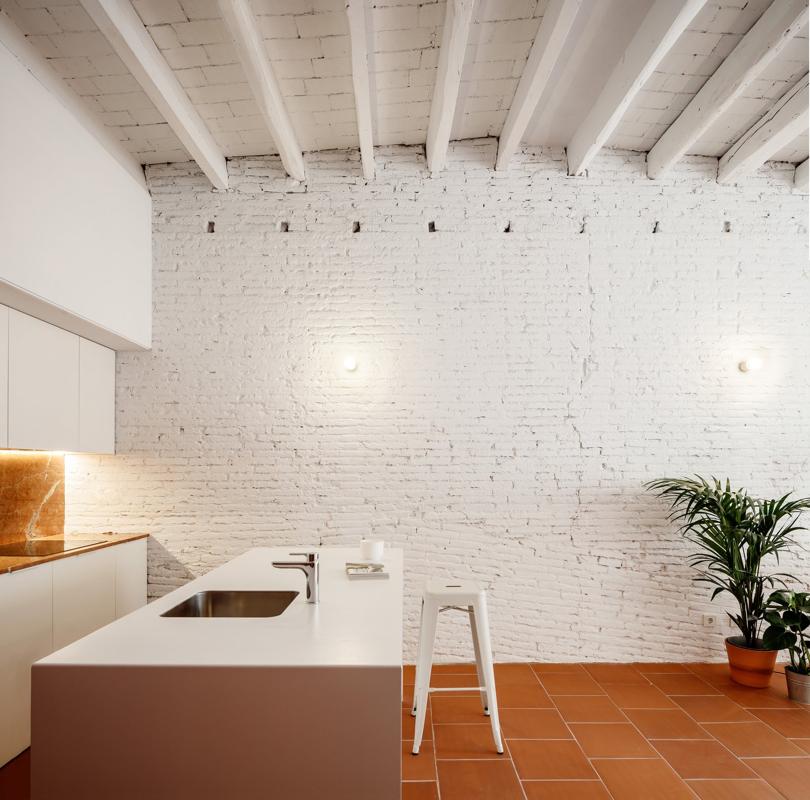
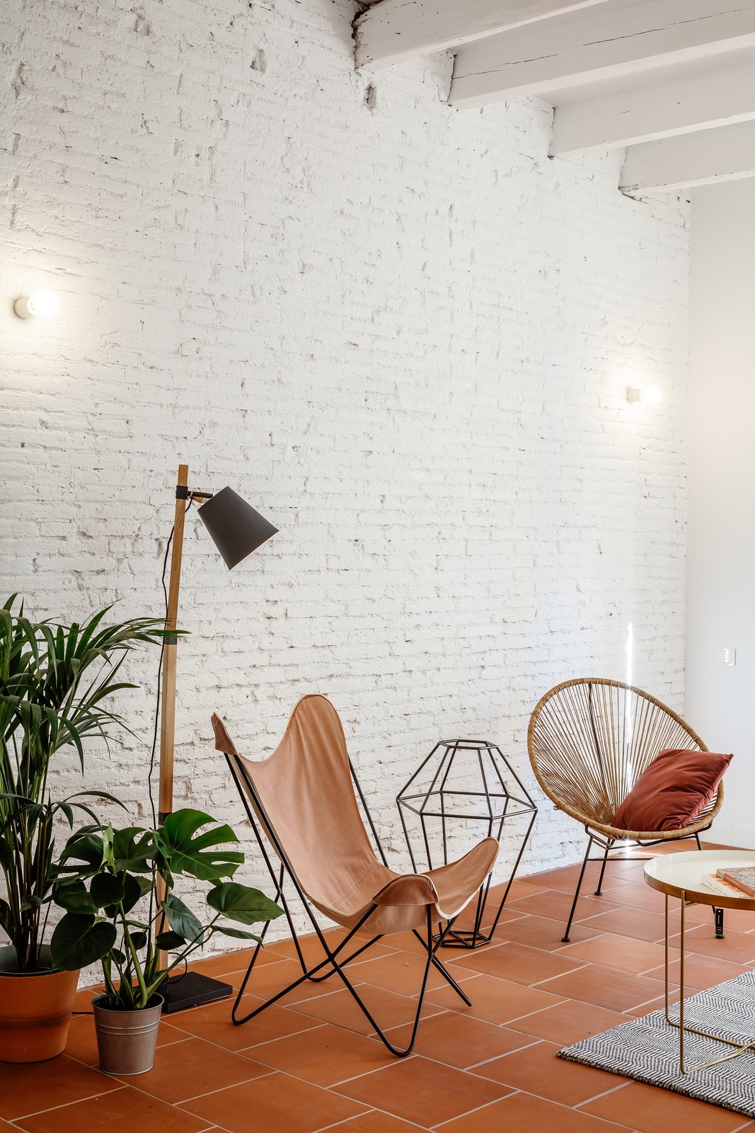
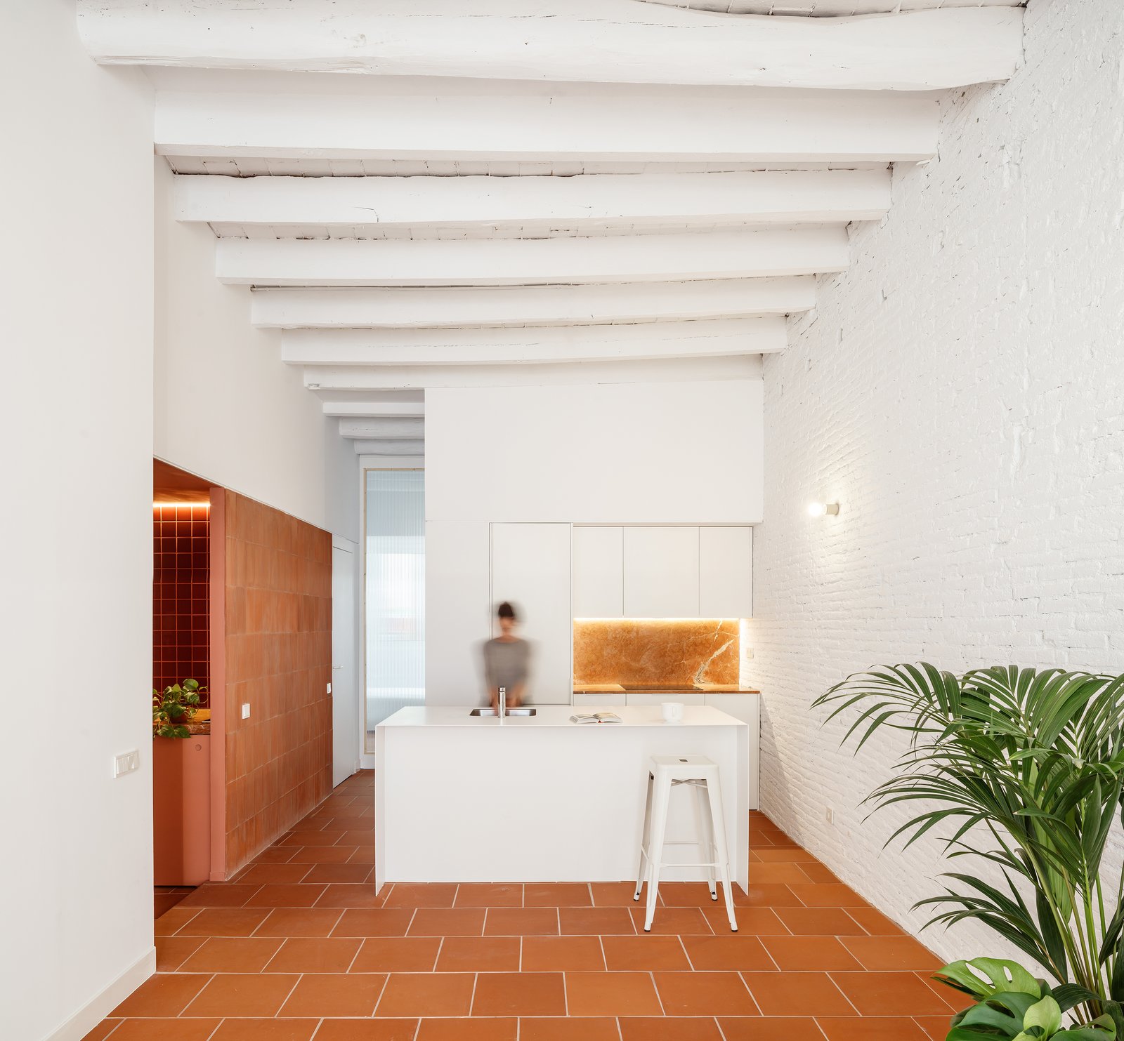
CRÜ studio removed a series of walls that divided the long and narrow perimeter of their new project la Odette – la Olga’s younger twin. The living area is pulled towards the back of the building, so that the bedrooms could absorb part of the light that is filtered through the main façade.
In la Odette CRÜ worked on contrasts between natural materials to break the volume up into planes and to enhance and reinforce the distribution and use of spaces, which makes the spatial lecture have some complexity, being less global. This is translated into a back set made of exposed brickwork and vaulted ceilings both painted in white, and an overlapping layer given by terracotta and reddish tiles and paint.
These warm accents help to break up the space into specific areas. Terracotta tiles placed reversed cover a section of wall beside the kitchen, while the hallway and bathroom are finished with maroon tiles and raw bricks. Terracotta tiles cover floors throughout the space.
“We covered a piece of a wall with the tiles that were left over from the flooring, but they were pasted on the wall showing their back, creating a powerful vertical terracotta texture on a white wall,” architect Clàudia Raurell.
“We found La Odette with way too many partitions regarding its dimensions and its availability of natural light and ventilation,” she continued.
“We worked on contrasts to break the volume up into planes, a gesture that makes the space have some complexity.”
The kitchen is fitted with red polished marble from south Spain that contrasts a white central island.
A sliding corrugated glass door separates the master bedroom and the living area, allowing light to pass between the two spaces while maintaining privacy.
See more on Dwell.com: LA ODETTE - Barcelona, Cataluña, España
Homes near Barcelona, Cataluña, España
This Weekend: Savor the First Day of Fall (7 photos)
- At September 19, 2018
- By
- In Home and Design


Why Fall Is the Best Time for Planting (7 photos)
- At September 19, 2018
- By
- In Home and Design
Fall is the best time to garden, and it’s about time we realized this. Not only is cooler weather easier on new plants and tired bones, but planting in a spent garden with rain…

The Stonorov-Churchill Residence
- At September 19, 2018
- By
- In Home and Design
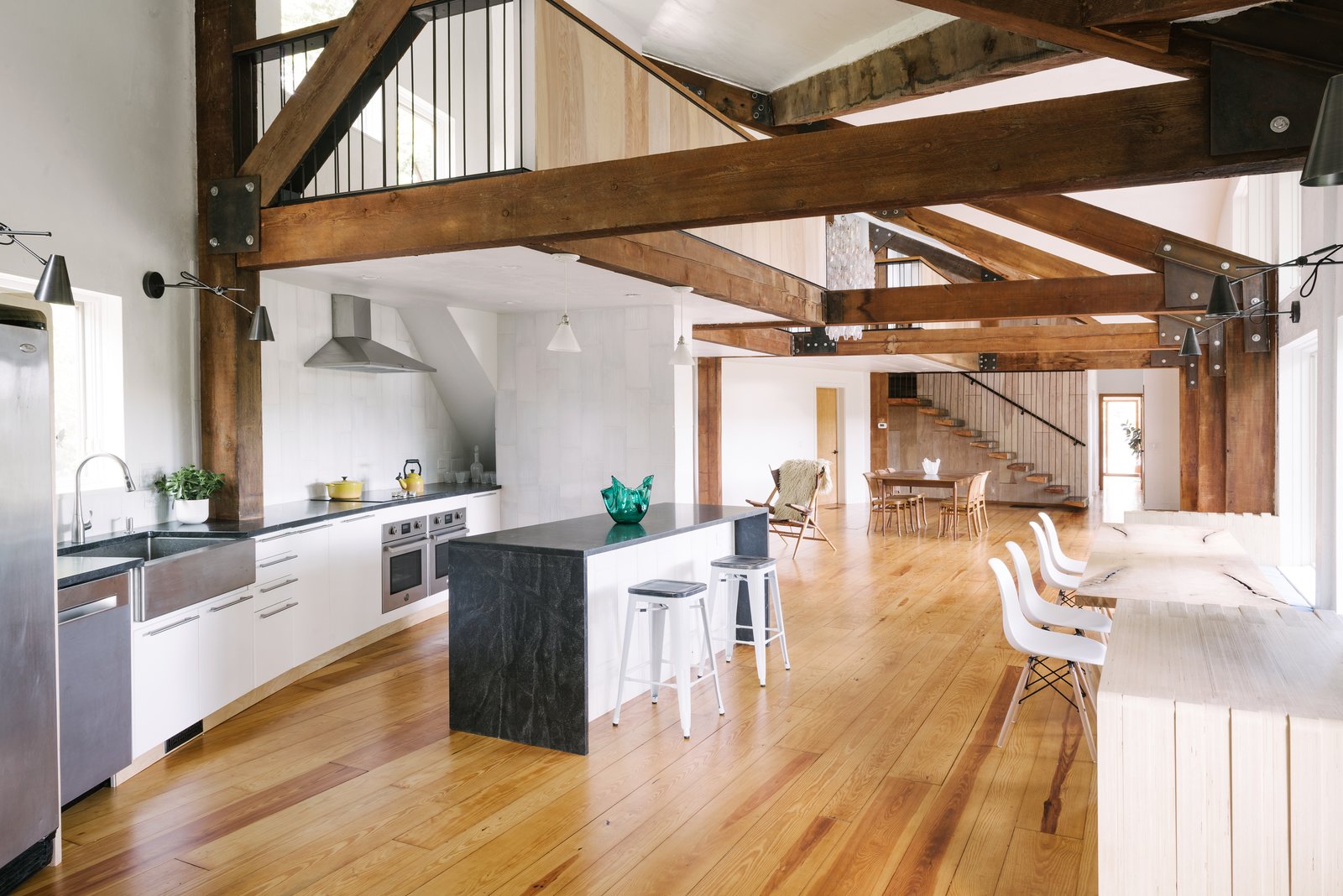
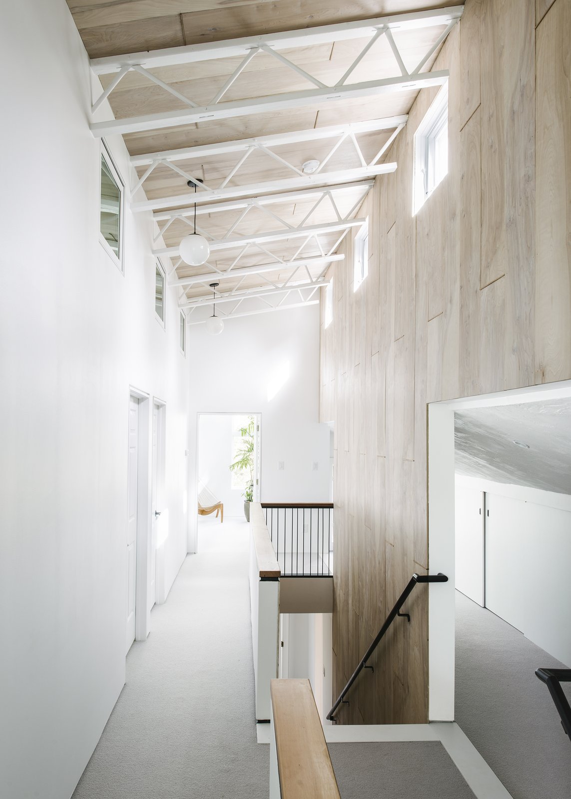
The Stonorov-Churchill Residence promotes a philosophy of living that speaks to the values of the Dwell community through a highly considered and intentional palette of materials and methodologies. Having never been published, the Stonorov-Churchill Residence exemplifies how thoughtfully considered design can create cost-effective solutions for celebrating the existing mid-century architecture and introducing a minimalist contemporary addition. The Stonorov-Churchill Residence, located in Phoenixville, PA, includes a 900 SF addition and complete re-model by New York based firm, BLDGWORKS.
Originally designed and built in 1979, the new owners, Tasha Stonorov and Michael Churchill, both children of mid-century and internationalist style architects (Oskar Stonorov & Henry Churchill), sought to enhance the livability of the home for a young family of four while retaining the great entertaining spaces of the existing structure.
BLDGWORKS, an emerging develop/design/build firm, worked closely with the builder, trade contractors, local artisans and self-performed specialty scopes to create a bespoke vocabulary out of utilitarian materials. Those that drove the aesthetic and function of the project include white-washed birch paneling, CNC milled plywood casing, handmade custom ceramic tiles and double-tapered sawn beam treads.
These materials are wrapped throughout the volumes to instill a dialogue between the existing entertaining spaces and the new private addition, creating spatial continuity rather than separation and distinction. This results in a series of spaces that unfold as one moves through the larger public volumes to the private family areas.
Designed to be warm and welcoming, contemporary and functional, each detail has been carefully planned and executed in accordance to the lifestyle of a gregarious young family.

See more on Dwell.com: The Stonorov-Churchill Residence - Phoenixville, Pennsylvania
Homes near Phoenixville, Pennsylvania
 As a premier real estate agent in Lewisburg, I’m here to provide
you with all the resources and information you need to buy or sell real estate.
As a premier real estate agent in Lewisburg, I’m here to provide
you with all the resources and information you need to buy or sell real estate.
